Redesign of National Library Board(NLB) Mobile App

Scope
Group Project: Redesigning the National Library Board’s mobile application.
NLB(National Library Board) app allows the library member to be able to browse and borrow physical or digital books.
My role: UX research, Wire-framing, UI, Prototyping
Tools used: Sketch, Axure
The project is split into 4 phases
Discover
User Research (Interviews, Survey)
Define
Affinity Mapping
Persona
Problem Statement
Design
Competitive & Comparative Analysis
Prototyping
Deliver
Usability Testing
Reiterating on design based on user feedback
Phase 1: Discover
User Research
Research Goals
We interviewed 12 participants and surveyed 18 participants for this project. Interviews were a great way to gain deeper insights into user’s book buying/borrowing behaviors.
Phase 2: Define
Using affinity mapping we identified a few key insights on our user’s behaviors
Insights
Persona
We used the collated data and insights to form a fictional character who embodies our characteristics of our users.
Meet Lindy, she will help us understand how we can achieve user’s goals.
We used the collated data and insights to form a fictional character who embodies our characteristics of our users.
Problem Statement
Lindy needs a simplified way to find, borrow and return books so that she can spend more time on reading rather than trying to find things on the app.
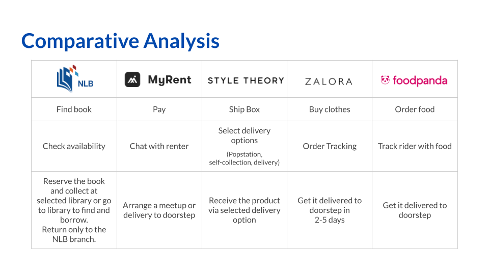
Comparative Analysis
Comparative analysis was used to ideate on the user flow after a purchase is made, in our case after the book is borrowed.
This analysis gave rise to one of our features pop-drop. Pop-drop was one of the features we created so that users are able to return the books at a popstation as 163 popstations (majority operates 24hrs) are scattered across Singapore as opposed to 26 library book drop locations
Phase 3: Design
Heuristics evaluation (Existing App)
We did an heuristics evaluation based on Jakob Nielsen 10 Usability Heuristics
Out of all the features we assessed, 2 main features that were critical to our user journey.
Search function not available on the e-book screen which violated flexibility and efficiency of use as well as not having consistency and standards
Not able to search, filter, sort within the e-book categories. Violated user control and freedom
Usability Test (Existing App)
We had 6 testing participants, testing on various usability tasks. At the end of each task participants were asked to rate an SEQ (Single Ease Question) score ranging from 1-7, 7 being the easiest to complete. We color coded the box, green indicating the task was completed, red meant failing the task.
Observation
2/6 users completing first task mistook the audio-book for the eBook
2/6 users were not able to locate the list of loans
2/6 users tried to look for Pride & Prejudice using multiple means before locating the book (poor search function)
Goals
Make it clear what format the book is in
Locate book loans easily
Search for books easy
Phase 4: Deliver
First Prototype
Goals
Make it clear what format the book is in
Locate book loans easily
Search for books easy
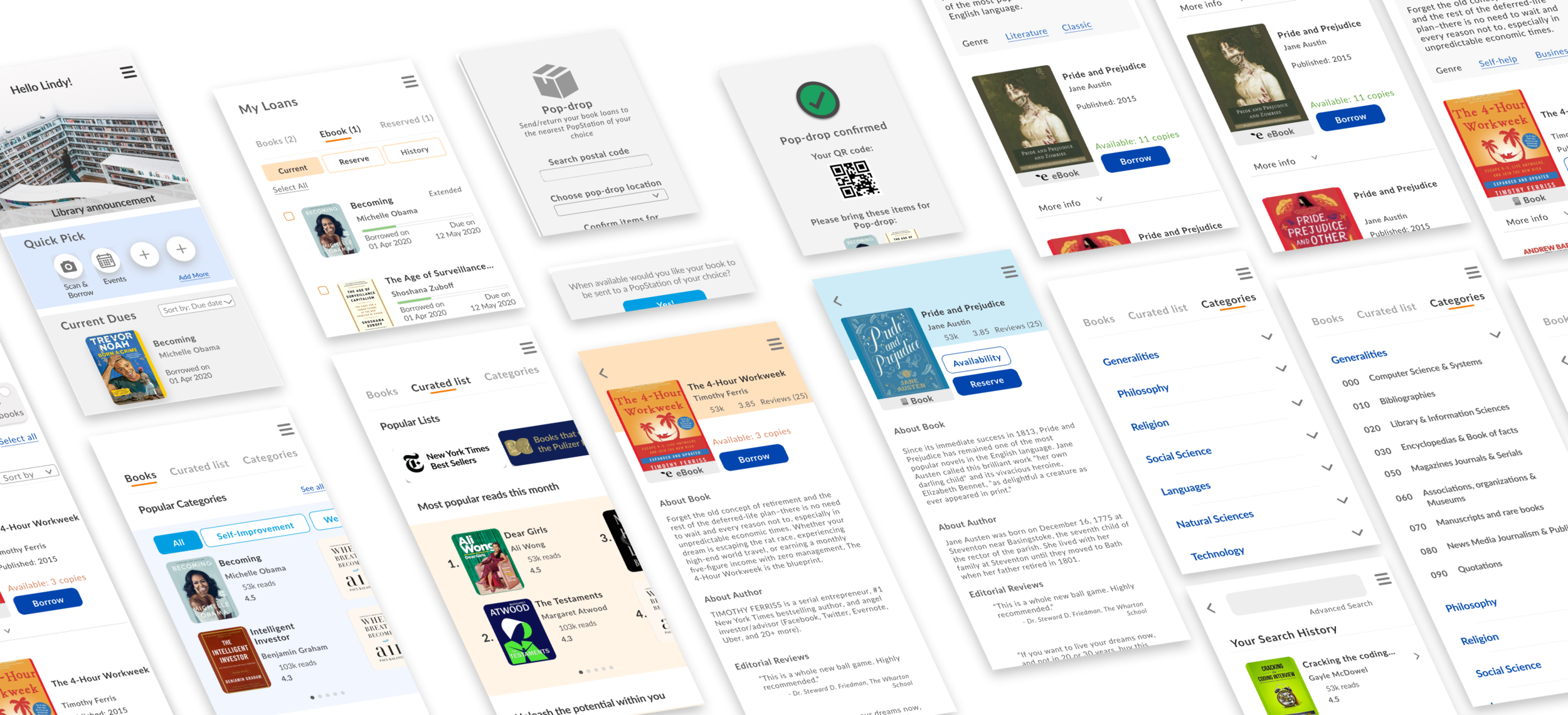
New features to meet Lindy’s goals
Easy Access
Lindy will be able to customize her home screen to allow her to place her most frequently used functions there
Pop Drop
Pop Drop allows Lindy to be able to conveniently drop her books at a popstation instead of making a trip down to the library
Features
Easy access tab
Recommended reads
Books nearing due dates
Loans section
Physical book availability
Pop-drop
Seat availability
Locate your nearest library
Prototype and iterations
Comparison of success rate for the usability tasks across the iterations
Evolution of “Pop-drop” feature
Business Considerations
Through the project, we have considered how a service such as Pop-drop could not only allow the user to conveniently return their borrowed books at the popstation near them. We have considered the possibility of borrowing books via the app and collect the books at the selected popstation of their convenience. This would possibly increase in users borrowing books via the feature as well as increasing more library memberships.
Another area of consideration was having a subscription-based membership. Subscription-based membership could be priced $5 per month. For paying for the subscription, premium users would enjoy the feature of pop-drop, attend invitations only events, increase in book borrowing limit as well as priority in reserving books. By creating a subscription-based service it could offset some of the cost for operating the feature of collecting/placing books at the popstation.
Takeaways
National Library Board app is a great app to help users to tap into the resources and services they have to offer. Through our case study we explored on the features that users had a problem with (Search, Knowing the book format, locate current book loans), as well as features that would enhance the user’s experience (Pop-drop and Easy Access).
Through the process, design sprints greatly helped us to align on the key features we should include and discuss on other potential areas where we could explore such as the pop-drop function.
Next steps after this project, we could explore other ways we could enhance the experience better. Such as building a community like a book club for the library, explore on other targeted groups like personalizing content for students, teachers, seniors and children, as well as develop further on identified features such as seat availability.


